Visualizations for mlr3cluster::PredictionClust.
The argument type controls what kind of plot is drawn.
Possible choices are:
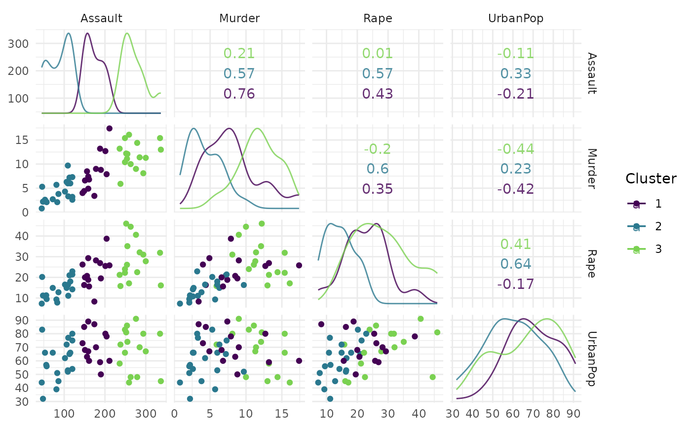
"scatter"(default): scatterplot with correlation values and colored cluster assignments."sil": Silhouette plot with mean silhouette value as the reference line. Requires package ggfortify."pca": Perform PCA on data and color code cluster assignments. Inspired by and uses ggfortify::autoplot.kmeans.
Usage
# S3 method for class 'PredictionClust'
autoplot(
  object,
  task,
  row_ids = NULL,
  type = "scatter",
  theme = theme_minimal(),
  ...
)
Arguments
- object
- task
- row_ids
(
integer()) Row ids to subset task data to ensure that only the data used to make predictions are shown in plots.- type
(character(1)):
Type of the plot. See description.- theme
(
ggplot2::theme())
Theggplot2::theme_minimal()is applied by default to all plots.- ...
(ignored).
References
Tang Y, Horikoshi M, Li W (2016). “ggfortify: Unified Interface to Visualize Statistical Result of Popular R Packages.” The R Journal, 8(2), 474–485. doi:10.32614/RJ-2016-060 .
Examples
if (mlr3misc::require_namespaces(c("clue", "mlr3cluster"), quietly = TRUE)) {
library(mlr3cluster)

task = tsk("usarrests")
learner = lrn("clust.kmeans", centers = 3)
object = learner$train(task)$predict(task)

head(fortify(object))
autoplot(object, task)
}
#> Warning: Factor variables are omitted in plot